Graph Sale Price Compared with Rateable Value
QuickMap allows you to view a graph showing how sale price compared with the capital value of a property have tracked over time in any area. This can be useful for illustrating what a property is likely to sell for compared to its capital value. It also shows the trend in house prices.
Click the Sales Button on the Toolbar. Use the Filter to select criteria then click on the Graph Button.
Select the require Graph options from the form below.
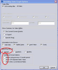
When Reporting Annually there are three additional options:
| • | Use 12 month range rather than year to date. eg if the current month is July, then report from July to July. |
| • | Adjust sales for CPI Values |
| • | Plot Entry Level Interest rates. These are "the interest rate values of the first mortgage offered to new borrowers for residential properties weighted by each surveyed institution's total lending outstanding for housing purposes" ie basically an indication of the interest rates in the reported year.. |
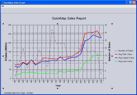
| • | The red line shows the average sale price each year since 1987. Maximum average sale price was in 2007. |
| • | The blue line shows the average capital value each year since 1987. Properties in this area are currently selling for slightly more than their Rateable Value. |
| • | The red line moving down relative to the blue line indicates that houses are going down in price. |
This graph can be saved as an image file by clicking on File>Save As and can subsequently inserted into a OFFICE document or opened in a Program such as MS Paint.